Last updated on 7 March, 2022, 8:07pm by
For a recent HTML5 banner project I needed to animate a custom shaped mask reveal that made a video element visible. In the past I have worked on projects that required similar visual effects, where the implementations used SVG elements and embedded the content to be revealed inside the SVG tag.*
*If you need to support IE11, this technique is not for you. And also, you have my sympathy.
In this latest project, I wanted to avoid SVG clip-paths and instead use the CSS mask-image property, the main advantage being that other elements in the DOM would not need to be embedded inside a SVG element (which can represent obstacles for absolute positioned elements, which I may elaborate further on in another post). Nevertheless, it’s easier said than done.
Below is an example of the effect in action.
  See the Pen
  creating an animated css mask reveal without embedding content within a SVG by Keston Neunie (@neunie)
  on CodePen.
Note: A cloud graphic (SVG) should scale up, revealing a video element playing, then the cloud scales down to 0, hiding the video element. You could use this technique to create a series of interesting transitions on your project. You can press Rerun (bottom right) to replay
After a bit of experimentation I came up with the formula above to correlate a ‘reveal’ element on top of a masked element and keep their transform origins in sync, so they scale together.
Once you understand this correlation it’s possible to go further and dynamically set your reveal properties – in sync with the mask-image-position, using a little bit of Javascript.
//this function uses the formula above to dynamically set the properties for the reveal element.
function maskPrep () {
    var maskedElement = document.querySelector('.masked')
    //CONVERT MASK POSITION PERCENTAGE INTO A DECIMAL
    if (window.getComputedStyle(maskedElement).getPropertyValue("-webkit-mask-position") != "") {
        maskedElementPosition = window.getComputedStyle(maskedElement).getPropertyValue("-webkit-mask-position")
        maskRevealOriginalSize = window.getComputedStyle(maskedElement).getPropertyValue("-webkit-mask-size")
    } else {
        maskedElementPosition = window.getComputedStyle(maskedElement).getPropertyValue("mask-position")
        maskRevealOriginalSize = window.getComputedStyle(maskedElement).getPropertyValue("mask-size")
    }
    var maskedElementPositionY = maskedElementPosition.split(' ').pop()
    var maskedPositionYString = maskedElementPositionY.split('%')
    var maskPositionDecimal = parseInt(maskedPositionYString) / 100
    var reveal = document.getElementById('reveal');
        reveal.style.transformOrigin = maskedElementPosition;

    //CALCULATE REVEAL ELEMENT TOP AND LEFT
    var revealHeight = reveal.clientHeight;
    var revealWidth = reveal.clientWidth;
    var maskedRegionWidth = maskedElement.clientWidth;
    var maskedRegionHeight = maskedElement.clientHeight;
    var calculatedTop = (maskedRegionHeight * maskPositionDecimal) - (maskPositionDecimal * revealHeight) + "px";
    var calculatedLeft = (maskedRegionWidth / 2) - (revealWidth / 2) + "px";
        reveal.style.top = calculatedTop;
        reveal.style.left = calculatedLeft;

    //CALCULATE MASK SCALE FOR GSAP
    var maskScaleWidth = maskScale * revealWidth;
    var maskScaleHeight = maskScale * revealHeight;
        maskExpandedDimensions = maskScaleWidth + 'px ' + maskScaleHeight + 'px';
}
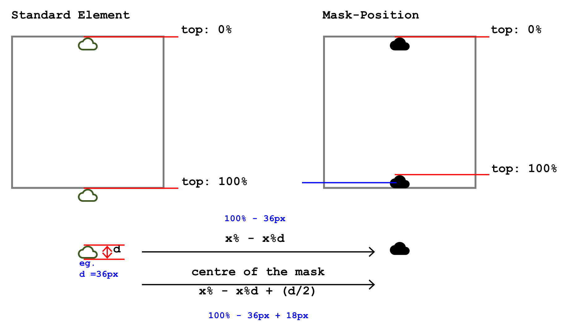
Positioning your mask with mask-position effectively resets the transform-origin of the mask to the same offset. Therefore, with effects such as the one in this example, you will notice the scaling up is not ‘center, center’, this is why the reveal overlay transform-origin has to match the mask-position (to keep the two elements in sync).
If you wanted to scale the scale from, the center of the mask – I found no properties to allow you to do that. The exception being if your mask is positioned 50% 50% - which is the only true center.
If your JavaScript isn’t strong and/or you’re animating fast motion and/or you’re working to tight time constraints, there could be a temptation to eyeball/guess the positioning of your reveal element. While you might get away with it in some cases, I find that it’s better to take the extra time to understand this all works, in case you need to do something similar again in the future.
Hope this helps somebody, somewhere, at some time.
Keston