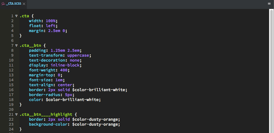
Figure 1 - Some CTA SASS with colour variables.
Last updated on 18 April, 2018, 11:58pm by
Despite reading about the benefits of the BEM (Block-Element-Modifier) convention in late 2013 – I confess I’ve only recently got around to fully integrating this way of working. I recently coded my last 3 website projects using a combination of BEM, SASS, Media Query Bubbling and Semantic Color Variable Naming - and I’m happy to report - these techniques form my most efficient HTML/CSS workflow to date! There are many insightful opinions on the various aspects of this combination (some referenced below). If you haven’t adopted these techniques yet or you’re weighing up the pros and cons, here’s a quick overview of why I have adopted (and in some parts, adapted) these ideas and why you should too!
If you’re a pro web developer, it’s fairly safe to assume you already know what SASS is and have integrated some type of CSS preprocessor into your workflow. If you’re new to SASS – the topline is - SASS extends the CSS language and gives us extra tools and options to build and manage more complex CSS projects. For an overview on SASS check out https://sass-lang.com/. Note: If you want to get up and running without having to use the command line, I’d recommend installing Codekit – which handles your setup and provides a clear user interface to configure your settings.
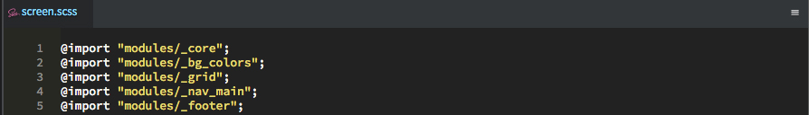
Back to this article… I’ve been using SASS for a number of years, mainly to split CSS into separate modules/files. My projects would consist of files such as core.scss, main_nav.scss, footer.scss etc – which get compiled into one single minified styles.css file.
I’ve also experimented with mixins, using variables and inheritance. However, without a consistent set of rules for naming classes for every project to follow, I often found that the CSS would still become difficult to maintain over time, especially when revisiting a project after months or when new features develop/evolve. An official class naming blueprint was missing. That’s where BEM comes in.

In essence the BEM (Block-Element-Modifier) convention, helps us write CSS that is more semantic and easier to keep organised into modules. The general idea is to separate different HTML sections into 'blocks'. Each block can contain it's own associated 'elements' and each block, (or it's individual elements) and be assigned 'modifier' classes. This leads to CSS declarations that are much easier to organise and identify the relationships between. It also helps you to namespace your code to avoid clashes, as well as build up a repository of reusable code modules.
Using BEM makes class naming much easier (than having no convention), once you get your head around the concept. For a fuller overview on BEM check out http://getbem.com/naming/. Once your modules or ‘blocks’ are defined, everything nested within those blocks becomes either an element or a modifier. I’ve found that this often results in more classes appended to my HTML but less CSS declarations overall, hence more manageable CSS! When to define a section as an element or new block is a bit subjective but my rule of thumb is: if a section of code can be reused without any parent blocks, it is a block in it’s own right, otherwise it’s an element of it’s parent block. Here’s an example of the site navigation on my portfolio website.

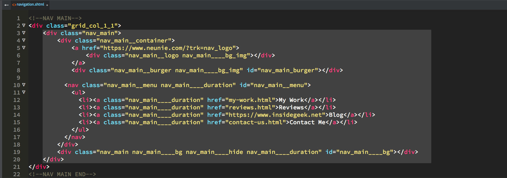
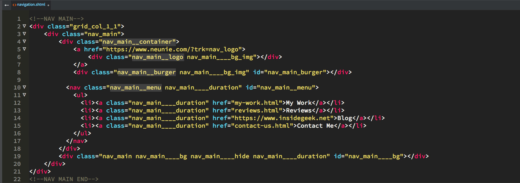
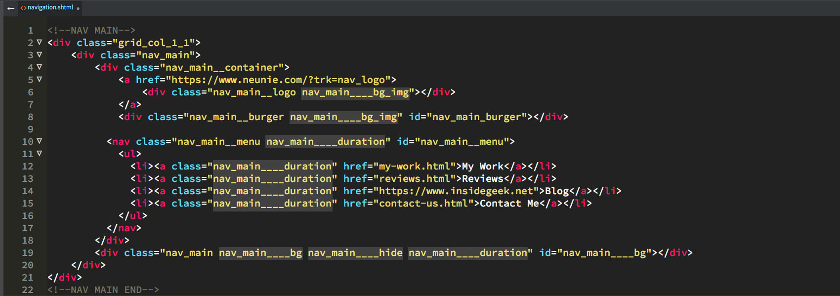
If you use BEM already, you will notice that my mark up is slightly different from the accepted convention! For modifiers, the convention uses 2 dashes then the modifier name –modifier. However, I prefer to use 4 underscores instead of 2 dashes, resulting in modifiers that look like these ____modifier. The reason I do this is because, using all underscores, I can double click my class names to select them. With dashes prefixing the modifiers, double clicking would by default, only select up to the dashes so the purpose of this adaptation is solely for selection efficiency. Why 4 underscores and not 3? Well 3 is visually too similar to the 2 underscores used to denote an element. By using 4 underscores I find it sufficient in distinguishing between elements and modifiers.
So, at this point you’ve got SASS setup and your integrating BEM. But all modern web development requires sites to be responsive and display well across multiple devices. The most common way we do this is using media queries in our CSS.
When I first started integrating media queries into my style sheets, I used to list all the breakpoint media queries at the bottom of each css file and add classes, as and when needed for the changing layout. This approach does work but can quickly become difficult to read once the number of style sheet declarations and their properties grow. It also makes it difficult to reuse CSS modules in other projects as you have to go and track down each media query that uses a particular class. There must be a better way? And there is. Media query bubbling.
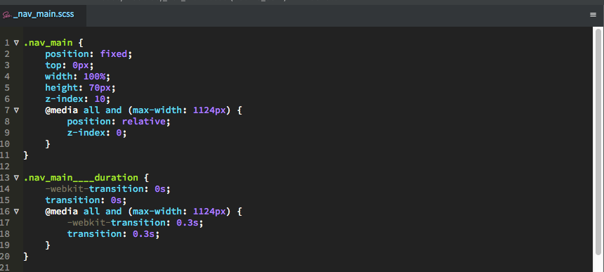
This technique essentially advocates that we nest our media queries within an individual class declaration, leading to singular, self-contained code that lives within one encompassing CSS block. Among the advantages of this techniques are the following: 1) Everything relating to a class is in one block, making it easier for you to track the property changes occurring as your class adapts for each media query (no scrolling up and down your files looking for breakpoints. 2) Though uncommon, it also means you could have a bespoke media query (breakpoint) for one class only if needed and the special circumstance would be easier to see at a glance.
Using the above approach, I refactored an existing website and was amazed at the reduction of CSS, as well as the improved clarity! Without exaggeration, this can be life changing! Debugging is quicker. The library of reusable code is cleaner and best of all, there’s a clear convention at work, that can be taught/shared with others if working in a team. Happy days! But there’s one more CSS bugbear that I haven’t discussed yet. Naming colour variables.
With all this SASS power at your fingerprints there is the potential to do great good, as well as digital evil. And by evil I’m talking about badly naming your colour variables. While there is technically no right or wrong way to name your colours, some approaches are more (or less) confusing than others. Most people would agree $white: #000000; would be a confusing choice of name.
Side Note:
I have found that the colour palette for most websites I develop, doesn’t exceed 15 colours so naming colours isn’t usually a bottomless task.
I’ve tried numerous approaches over the years 1) naming the colour in relation to the element it’s assigned to $footer-blue 2) naming and appending tints/shades $blue-dark, $blue-light 3) abstracting to $colour_1, $colour_2 etc. All seem fine in option 1) until the use of a colour shifts, say I want to use $footer-blue for a header border. Now the name is confused in that context. 2) You might found yourself with a string of variables such as $blue-dark, $blue-light, $blue-lighter, $blue-lighest… 3) $colour_1 is semantically meaningless.
I have found that giving your colours 'paint names' makes them more memorable and easy to apply to multiple contexts. This gives the colours a bit of personality, makes them easier to recognise and reference when discussing, if working in a team.
Some colours from my portfolio site include:
//CORE COLOURS
$color-midnight-black:     #000000;
$color-brilliant-white:    #ffffff;
$color-off-white:          #f3f4f4;
$color-timeless-grey:      #e1e1e1;
$color-silver:             #CCCCCC;
$color-nevada-grey:        #5e6163;
$color-dusty-orange:       #da7948;
$color-deep-royal-teal:    #052638;
$color-chathams-blue:      #0f4c6d;
But where can you get names from? You don’t want to waste time inventing whacky colour names when you have deadlines looming. If you have a Dulux colour fandeck to hand, you could quickly flick through and pick a name based on a colour similar to that which you are working with. Alternatively you could check out this cool colour naming site by Chirag Mehta http://chir.ag/projects/name-that-color/#B8B8FF, which will find a name based on a hex code that you enter.
To make this more tangible, I’ve included a project file you can download that uses all of the techniques in this article. Feel free to play around with the file, explore the HTML, CSS and SASS files to see how it all fits together! If new to SASS definitely download an evaluation copy of Codekit and give it a spin.
Remember my BEM syntax is adapted from the accepted convention. If you’re not fussed about double clicking to select classes, maybe it’s worth following the accepted convention for compatibility with other teams and developers.
Hope this helps,
Keston